Saturday, October 26, 2013

Getting Started with Qt Enterprise Embedded


Getting Started with Qt Enterprise Embedded

A demonstration of how easy it is to get started developing for embedded hardware with Qt Enterprise Embedded. The video shows basic usage and features of Qt Enterprise Embedded like creating a project, deploying to a device and on-device-debugging.

To learn more about Qt Enterprise Embedded, visit http://qt.digia.com/QtEnterpriseEmbedded

Thursday, October 24, 2013

Qt5 on Android

This video shows different QUIt Coding demos running on Nexus 7 & Qt 5.2 (beta).


Sources and more information are available in http://quitcoding.com

Qt 5.2 Beta, with binary installers, is now available.

Qt 5.2 Beta now comes with binary installers for Windows, Mac and Linux. You can get Qt 5.2 Beta from the Qt Project download area for open source users, and in the Qt Enterprise Customer Portal for existing Qt Enterprise customers.

Qt 5.2 come with great features, such as support for Android, iOS and Blackberry 10, new Scene Graph renderer, new Qt-specific Javascript engine, new beta for Qt Creator 3.0... Know more: http://blog.qt.digia.com/blog/2013/10/23/qt-5-2-beta-available/.

Tuesday, October 15, 2013

QtQuick example: resizing Window

QtQuick example: resizing Window


import QtQuick 2.1
import QtQuick.Controls 1.0
import QtQuick.Window 2.0

ApplicationWindow {
    title: "Qteveloper (http://qteveloper.blogspot.com/)"
    width: 400
    height: 380

    menuBar: MenuBar {
        Menu {
            title: "Sub-Window"
            MenuItem {
                text: "Open"
                onTriggered: myWindow.open();
            }
            MenuItem {
                text: "Close"
                onTriggered: myWindow.close();
            }
        }
    }

    Window{
        id: myWindow
        title: "Child Window"
        width: 300
        height: 300
        visible: false
        function open(){
            visible = true
        }
        function close(){
            visible = false
        }

        Rectangle {
            anchors.fill: parent

            Button {
                id: maxMe
                anchors.horizontalCenter: parent.horizontalCenter
                anchors.top: parent.top
                text:"Maximize me"
                width: parent.width
                tooltip:"Maximize this child window"
                onClicked: myWindow.showMaximized()
            }
            Button {
                id: normalizeMe
                anchors.horizontalCenter: parent.horizontalCenter
                anchors.top: maxMe.bottom
                text:"Normalize me"
                width: parent.width
                tooltip:"Normalize this child window"
                onClicked: myWindow.showNormal()
            }
            Button {
                id: minMe
                anchors.horizontalCenter: parent.horizontalCenter
                anchors.top: normalizeMe.bottom
                text:"Minimized...but not work as expected!"
                width: parent.width
                tooltip:"Minimized this child window"
                onClicked: myWindow.showMinimized()
            }
            Button {
                id: closeMe
                anchors.horizontalCenter: parent.horizontalCenter
                anchors.bottom: parent.bottom
                text:"Close me"
                width: parent.width
                tooltip:"Close this child Window"
                onClicked: myWindow.close()
            }
        }
    }
}


Friday, October 11, 2013

Android deployment in Qt 5.2

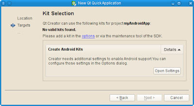
In the upcoming release of Qt 5.2 for Android, the “Getting Started”-experience will be improved, and polishing in general. For example, this has implied quite a few improvements to how Android is presented in Qt Creator 3.0, to make it easier the first time you sit down to write an Android application in Qt.

Qt 5.2 for Android
Kit selection of Qt 5.2 for Android
Know more: Qt Blog

Tuesday, October 8, 2013

QtQuick example: Image

Example to use Image:

QtQuick example: Image


import QtQuick 2.1
import QtQuick.Controls 1.0

ApplicationWindow {
    title: "Qteveloper (http://qteveloper.blogspot.com/)"
    width: 420
    height: 380

    menuBar: MenuBar {
        Menu {
            title: "Load Image"
            MenuItem {
                text: "image1"
                onTriggered: myImage.source = "http://goo.gl/kdbgF8"
            }
            MenuItem {
                text: "image2"
                onTriggered: myImage.source = "http://goo.gl/6n8lX7"
            }
            MenuItem {
                text: "no image"
                onTriggered: myImage.source = ""
            }
        }
    }

    Image{
        id: myImage
        anchors.centerIn: parent
        source: "http://goo.gl/kdbgF8"
    }

}


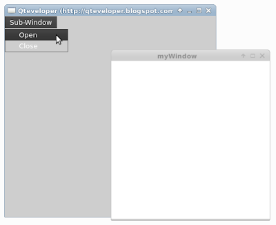
QtQuick example: open and close new Window

QtQuick example: open and close new Window


import QtQuick 2.1
import QtQuick.Controls 1.0
import QtQuick.Window 2.0

ApplicationWindow {
    title: "Qteveloper (http://qteveloper.blogspot.com/)"
    width: 400
    height: 380

    menuBar: MenuBar {
        Menu {
            title: "Sub-Window"
            MenuItem {
                text: "Open"
                onTriggered: myWindow.open();
            }
            MenuItem {
                text: "Close"
                onTriggered: myWindow.close();
            }
        }
    }

    Window{
        id: myWindow
        title: "myWindow"
        width: 300
        height: 300
        visible: false
        function open(){
            visible = true
        }
        function close(){
            visible = false
        }
    }
}


Sunday, October 6, 2013

QtQuick Controls example: GroupBox

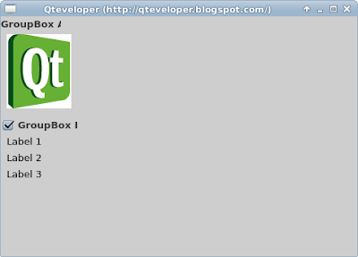
GroupBox provides a frame, a title on top and displays various other controls inside itself. Group boxes can also be checkable.

GroupBox example
GroupBox example


import QtQuick 2.1
import QtQuick.Controls 1.0
import QtQuick.Window 2.0
import QtQuick.Layouts 1.0

ApplicationWindow {
    title: "Qteveloper (http://qteveloper.blogspot.com/)"
    width: 480
    height: 320

    ColumnLayout{

        GroupBox {
            id: groupBoxA
            title: "GroupBox A"
            Layout.fillWidth: true
            Image {
                source: "http://goo.gl/kdbgF8"
            }
        }

        GroupBox {
            id: groupBoxB
            title: "GroupBox B"
            Layout.fillWidth: true
            checkable: true

            ColumnLayout {
                anchors.fill: parent
                Label { text: "Label 1" }
                Label { text: "Label 2" }
                Label { text: "Label 3" }
            }
        }

    }

}


Saturday, October 5, 2013

QtQuick Controls: SplitView


import QtQuick 2.1
import QtQuick.Controls 1.0
import QtQuick.Window 2.0
import QtQuick.Layouts 1.0

ApplicationWindow {
    title: qsTr("Hello World")
    width: 640
    height: 480

    SplitView{
        anchors.fill: parent
        orientation: Qt.Horizontal

        Rectangle{
            width: 100
            Layout.minimumWidth: 200
            Image {
                width: 500
                height: 250
                source: "http://goo.gl/ZfY4AM"
            }
        }

        Rectangle{
            Layout.minimumWidth: 50
            Image {
                source: "http://goo.gl/ZfY4AM"
            }
        }
    }
}


Related: QtQuick Controls: ScrollView

Friday, October 4, 2013

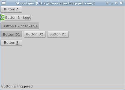
QtQuick Controls: Apply Action to Buttons

QtQuick Controls: Apply Action to Buttons


import QtQuick 2.1
import QtQuick.Controls 1.0
import QtQuick.Window 2.0
import QtQuick.Layouts 1.0

ApplicationWindow {
    title: "Qteveloper (http://qteveloper.blogspot.com/)"
    width: 480
    height: 320

    ColumnLayout{

        Button { action: actionButtonA }
        Button { action: actionButtonB }
        Button { action: actionButtonC }

        RowLayout{
            Button { action: actionButtonD1 }
            Button { action: actionButtonD2 }
            Button { action: actionButtonD3 }
        }
        Button { action: actionButtonE }
    }

    Action{
        id: actionButtonA
        text: "Button A"
        onTriggered: statusLabel.text = "Button A Triggered "
    }

    Action{
        id: actionButtonB
        text: "Button B - Logo"
        iconSource: "qtlogo.png"
        onTriggered: statusLabel.text = "Button B Triggered "
    }

    Action{
        id: actionButtonC
        text: "Button C - checkable"
        checkable: true
        onCheckedChanged: statusLabel.text = "Button C checked: " + checked
    }

    ExclusiveGroup {
        id: group_D

        Action{
            id: actionButtonD1
            text: "Button D1"
            checkable: true
            onCheckedChanged: {
                if(checked){
                    statusLabel.text = "Button D1 checked"
                }
            }
        }

        Action{
            id: actionButtonD2
            text: "Button D2"
            checkable: true
            onCheckedChanged: {
                if(checked){
                    statusLabel.text = "Button D2 checked"
                }
            }
        }

        Action{
            id: actionButtonD3
            text: "Button D3"
            checkable: true
            onCheckedChanged: {
                if(checked){
                    statusLabel.text = "Button D3 checked"
                }
            }
        }

        Action{
            id: actionButtonE
            text: "Button &E"
            shortcut: "Ctrl+E"
            onTriggered: statusLabel.text = "Button E Triggered "
        }
    }

    statusBar: StatusBar{
        RowLayout{
            Label{
                id: statusLabel
                text: "Status Bar"
            }
        }
    }
}


Related: QtQuick Controls: Example to apply Action to MenuItem and ToolButton

Thursday, October 3, 2013

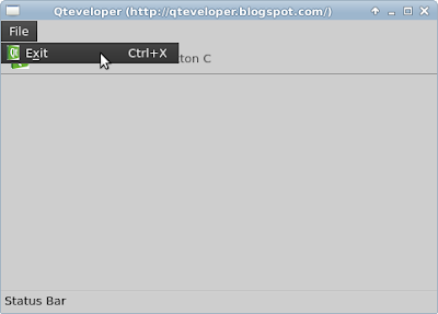
QtQuick Controls: Example to apply Action to MenuItem and ToolButton

Example to apply Action to MenuItem and ToolButton


import QtQuick 2.1
import QtQuick.Controls 1.0
import QtQuick.Window 2.0
import QtQuick.Layouts 1.0

ApplicationWindow {
    id: myWindow
    title: "Qteveloper (http://qteveloper.blogspot.com/)"
    width: 480
    height: 320

    menuBar: MenuBar {
        Menu {
            title: qsTr("File")
            MenuItem {
                action: actionExit
            }
        }
    }

    toolBar: ToolBar{
        RowLayout{
            ToolButton{ action: actionToolButtonA }
            ToolButton{ action: actionToolButtonB }
            ToolButton{ action: actionToolButtonC }
        }
    }

    Action{
        id: actionExit
        text: "E&xit"
        shortcut: "Ctrl+X"
        iconSource: "qtlogo.png"
        onTriggered: Qt.quit()
    }

    Action{
        id: actionToolButtonA
        text: "ToolButton A"
        onTriggered: statusLabel.text = "ToolButton A Triggered "
        iconSource: "qtlogo.png"
    }

    Action{
        id: actionToolButtonB
        text: "ToolButton B"
        checkable: true
        onCheckedChanged: statusLabel.text = "ToolButton B Checked - "
                          + checked
    }

    Action{
        id: actionToolButtonC
        text: "ToolButton C"
        checkable: true
        onCheckedChanged: statusLabel.text = "ToolButton C Checked - "
                          + checked
    }

    statusBar: StatusBar{
        RowLayout{
            Label{
                id: statusLabel
                text: "Status Bar"
            }
        }
    }
}


Related: QtQuick Controls: Apply Action to Buttons

Wednesday, October 2, 2013

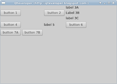
QtQuick.Layouts: GridLayout

GridLayout
QtQuick.Layouts: GridLayout


import QtQuick 2.1
import QtQuick.Controls 1.0
import QtQuick.Window 2.0
import QtQuick.Layouts 1.0

ApplicationWindow {
    id: myWindow
    title: "Qteveloper (http://qteveloper.blogspot.com/)"
    width: 480
    height: 320

    GridLayout{
        columns: 3
        Button { text: "button 1"}
        Button { text: "button 2"}
        ColumnLayout{
            Label { text: "label 3A"}
            Label { text: "Label 3B"}
            Label { text: "label 3C"}
        }
        Button { text: "button 4"}
        Label{ text: "label 5"}
        Button { text: "button 6"}
        RowLayout{
            Button { text: "button 7A"}
            Button { text: "button 7B"}
        }
    }
}


Tuesday, October 1, 2013

QtQuick.Layouts: ColumnLayout

ColumnLayout
QtQuick.Layouts: ColumnLayout


import QtQuick 2.1
import QtQuick.Controls 1.0
import QtQuick.Window 2.0
import QtQuick.Layouts 1.0

ApplicationWindow {
    id: myWindow
    title: "Qteveloper (http://qteveloper.blogspot.com/)"
    width: 480
    height: 320


    ColumnLayout{
        Button { text: "button 1"}
        Button { text: "button 2"}
        ColumnLayout{
            Label { text: "label 3A"}
            Label { text: "Label 3B"}
            Label { text: "label 3C"}
        }
        Button { text: "button 4"}
    }
}


QtQuick.Layouts: RowLayout

RowLayout
QtQuick.Layouts: RowLayout


import QtQuick 2.1
import QtQuick.Controls 1.0
import QtQuick.Window 2.0
import QtQuick.Layouts 1.0

ApplicationWindow {
    id: myWindow
    title: "Qteveloper (http://qteveloper.blogspot.com/)"
    width: 480
    height: 320


    RowLayout{
        Button { text: "button 1"}
        Button { text: "button 2"}
        RowLayout{
            Label { text: "label 3A"}
            Label { text: "Label 3B"}
            Label { text: "label 3C"}
        }
        Button { text: "button 4"}
    }
}


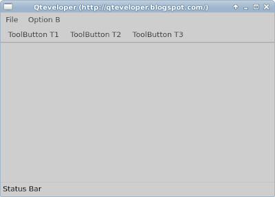
QtQuick Controls: ApplicationWindow, MenuBar, ToolBar and StatusBar

ApplicationWindow, MenuBar, ToolBar and StatusBar
QtQuick Controls: ApplicationWindow, MenuBar, ToolBar and StatusBar

import QtQuick 2.1
import QtQuick.Controls 1.0
import QtQuick.Window 2.0
import QtQuick.Layouts 1.0

ApplicationWindow {
    id: myWindow
    title: "Qteveloper (http://qteveloper.blogspot.com/)"
    width: 480
    height: 320


    menuBar: MenuBar {
        Menu {
            title: qsTr("File")
            MenuItem {
                text: qsTr("Exit")
                onTriggered: Qt.quit();
            }
            MenuItem {
                text: "File - Item 2"
                onTriggered: statusLabel.text = "File - Item 2 Triggered"
            }
        }
        Menu {
            title: "Option B"
            MenuItem {
                text: "Opt B1"
                onTriggered: statusLabel.text = "Opt B1 Triggered"

            }
            MenuItem {
                text: "Opt B2"
                checkable: true
                onCheckedChanged: statusLabel.text = "Opt B2 Checked - "
                                  + checked
            }
            MenuItem {
                text: "Opt B3"
                checkable: true
                onCheckedChanged: statusLabel.text = "Opt B3 Checked - "
                                  + checked
            }
        }
    }

    toolBar: ToolBar{
        RowLayout{
            ToolButton{
                text: "ToolButton T1"
                onClicked: statusLabel.text = "ToolButton T1 clicked"
            }
            ToolButton{
                text: "ToolButton T2"
                onClicked: statusLabel.text = "ToolButton T2 clicked"
            }
            ToolButton{
                text: "ToolButton T3"
                onClicked: statusLabel.text = "ToolButton T3 clicked"
            }
        }
    }

    statusBar: StatusBar{
        RowLayout{
            Label{
                id: statusLabel
                text: "Status Bar"
            }
        }
    }
}


~ QtQuick Controls: Example to apply Action to MenuItem and ToolButton

QtQuick Controls: ScrollView

Example of using ScrollView in QtQuick.Controls 1.0.

There are two Images in the window, both loaded from the same source at internet. The upper one place within a ScrollView, the bottom one is a standalone image.

QtQuick Controls: ScrollView

import QtQuick 2.1
import QtQuick.Controls 1.0

Rectangle {
    width: 500
    height: 500

    //Image within ScrollView
    ScrollView{
        id: myScrollView
        anchors.top: parent.top
        width: 500
        height: 250
        Image {
            source: "http://goo.gl/ZfY4AM"
        }
    }

    //standalone Image
    Image {
        anchors.top: myScrollView.bottom
        width: 500
        height: 250
        source: "http://goo.gl/ZfY4AM"
    }
}


Related: QtQuick Controls: SplitView